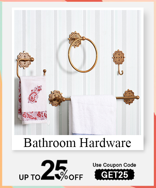
The “wow factor” in interiors is like chiaroscuro in painting—it plays with light and contrast to dramatize the mundane. It is that one brushstroke that catches the viewer’s breath, an arresting focal point around which the room composes its narrative. This could be a Venetian mirror reflecting old-world charm or a statement sculpture that punctuates stillness with motion. It is less about flamboyance and more about balance—a daring hue that interrupts a muted palette, or a vintage door knocker that whispers stories. Like a well-timed pause in theatre, the wow factor lives in contrast and silence, inviting both awe and inquiry.
The “wow factor” in interior design is a sensory signature—an emotional crescendo within a room’s symphony. It’s the equivalent of impasto in visual arts, where textures protrude and demand touch, observation, pause. In design, this translates to bold centerpieces, striking lighting arrangements, or antique wall art that draws a visceral reaction. Designers often deploy scale, contrast, texture, or rarity as their palette. A hand-carved wooden console amidst modern geometry or an exaggerated archway breaking linear monotony can provoke that ‘wow.’ It is less about expensive decor and more about curated emotion—a moment that disturbs the visual monotony and stirs the soul like an abstract painting that haunts you days after. It anchors memory, making the space unforgettable.
Like the dominant hue in a Mark Rothko painting, the wow factor dictates how one feels in a space before understanding why. It’s not decorative—it’s affective. It governs first impressions, pulling the visitor into a dialogue with the space. Homes without a wow factor often fade into the background like uninspired sketches—functional but forgettable. A bold light fixture over a reclaimed wood dining table, or a mural wall in an otherwise subtle palette, not only captures attention but frames identity. For homeowners, it becomes a brushstroke of self-expression. For guests, it serves as an emotional cue—drama, serenity, curiosity. In essence, it renders the static dynamic, turning mere structure into a living canvas. This element arrests perception and invites emotional resonance, much like the focal point in a gallery composition.
Designers define visual impact the way an art critic reads composition—it’s the interplay of form, space, color, and light, orchestrated to command attention. It's the silhouette in sculpture, the rhythm in architecture, and the leading lines in photography. In interiors, visual impact is engineered through contrast (like Rembrandt’s use of light), scale (a cathedral ceiling), and framing (a corridor leading to a view). Texture plays a major role too—a velvet accent chair on a distressed jute rug creates tactile dialogue. Professionals assess impact not just by what pleases the eye, but by what lingers in the viewer’s memory. It is both visceral and structured—a planned spontaneity. The aim is to guide the eye, stir a reaction, and ultimately brand the space in one’s mental gallery. Impact, thus, is not noise; it’s visual authority, delivered through artistic restraint or calculated boldness.
Read More : Tips to Give Your Bedroom A Refreshing Makeover
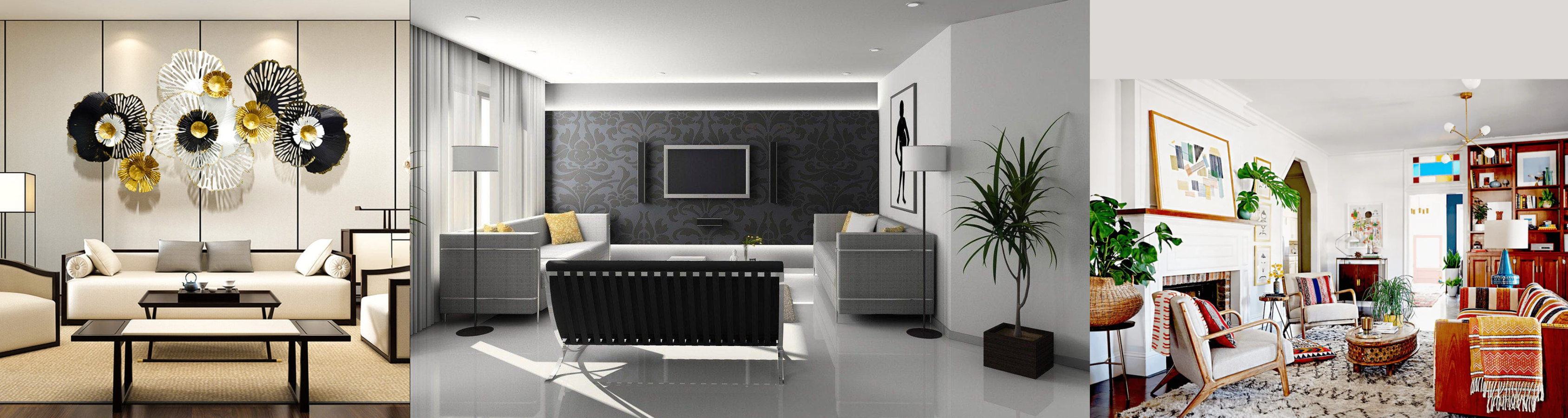
A room speaks in stillness before sound—focal points are its first brushstroke. They hold weight like the subject of a chiaroscuro painting. In a living space, the eye is instinctively pulled to what interrupts or anchors the composition: a bold piece of furniture, an art frame layered with texture, a vintage mirror refracting movement. These aren’t just objects; they are subjects, framed by architectural lines and negative space. A fireplace becomes a vanishing point; a well-dressed window, a portal. These anchors must carry narrative tension—something inherited, or provocatively new. The balance lies not in symmetry, but in emotional gravity. A focal point needn’t shout; it must hum—draw you in like an unfinished sentence. Whether it’s a velvet chair placed asymmetrically or a single sculpture lit like a performer before entrance, it’s always the element that holds the room’s breath in its chest.
Immediate attention is drawn to what disorients gently—a contrasting color, a bold silhouette, a texture that defies the room’s rhythm. Think of a sudden crimson against an otherwise muted oil painting. In interiors, it's often a deliberate gesture: a deep blue couch in an earth-toned setting, or an abstract art piece that breaks the geometric mood. Mirrors, particularly antique or irregularly shaped ones, command attention like spotlights on stage—both reflective and narrative. Elements that hold or suggest motion—drapes caught mid-fall, organic patterns, sculptural lighting—also captivate. Just like a strong opening line in a monologue, it’s not volume but presence. Presence built through contrast, positioning, and material. Natural materials—stone, aged wood, metal with patina—draw the eye because they tell time. A room curated with restraint amplifies the single object that dares to feel alive. That’s where attention goes: where stillness and tension hold hands.
Lighting, like stage direction, shapes perception. To highlight focal points, one must sculpt shadows, not just banish them. Accent lighting acts like brushstrokes of gold leaf—it does not illuminate everything, only what matters. Spotlights create intimacy; wall washers stretch attention across textured surfaces. A pendant light above a table draws eyes like a halo—anointing the space below. Directional lighting can carve a painting out of an ordinary wall, isolating it from clutter. Dimmers are like tempo control in performance; with softer light, the room breathes, allowing focal points to whisper instead of yell. Contrast is key: an artwork under warm light in a cool-lit room becomes magnetic. Use shadows to frame—let darkness give edge to illumination. The interplay is like chiaroscuro—light defines form, but shadow defines feeling. A focal point is not just seen—it’s unveiled, like the face of a character waiting behind the curtain.
Drama lives in liminality—in entrances, thresholds, and spaces between function. The best areas for drama are the ones where motion pauses: entryways, transitions between rooms, staircases, corners. Think of these spaces as prologues; even a quiet nook can become a tableau with the right composition. A console table with a striking sculpture in the hallway reads like a first sentence. Ceiling height can be dramatized through vertical installations—floor-to-ceiling drapes or a sculptural chandelier. Corners can become vignettes with a chair and a standing lamp, turning void into voice. Window bays, when treated right, act like natural theatres—daylight becomes a slow-moving actor. Even a powder room, often overlooked, can burst with cinematic intensity through bold wallpaper, moody lighting, or reflective surfaces. Like in painting, a small canvas with high contrast often holds more power than a sprawling neutral one. Drama isn’t scale—it’s intent sharpened by restraint.
A statement piece in home décor acts much like a focal brushstroke in a painting—disruptive yet harmonious, commanding attention through scale, color, or form. It’s not merely an object but a visual anchor, a deliberate intrusion that orchestrates drama within the spatial composition. Whether a sculptural chair, an oversized mirror, or a richly textured rug, it interrupts monotony, adding rhythm and tension. Like chiaroscuro in a Caravaggio, the contrast it creates heightens the room’s narrative, inviting the eye to linger. This interplay between restraint and boldness evokes an emotional response, turning a functional space into an immersive tableau. The statement piece becomes an artistic dialogue—balancing light and shadow, texture and smoothness—ultimately elevating the ambiance beyond decoration to expression.
A statement piece qualifies as such when it transcends utility and becomes a visual manifesto—a declaration of taste and emotion within the room’s canvas. It demands presence through scale, color saturation, or unique form, disrupting the visual hierarchy like an impasto stroke in a Van Gogh landscape. This piece resists anonymity, often crafted with distinct texture or an unconventional silhouette that interrupts rhythm and pulls focus. It could be a dramatic chandelier, a baroque console, or a bold piece of wall art—each possessing a sculptural quality, inviting viewers to engage visually and sensorially. The hallmark lies in its ability to inflect the space’s mood and character, becoming the thematic centerpiece around which all other elements subtly revolve, ensuring the décor breathes with depth rather than flatness.
Bold furnishings act as a painter’s palette—infusing vitality and texture where flatness once prevailed. They function as dramatic strokes that energize spatial neutrality, converting a passive canvas into a dynamic composition. By injecting color contrasts, textural interplay, or monumental form, these pieces disrupt the monotony, creating a visual rhythm that guides movement and perception. Like a splash of cadmium red or cobalt blue on an otherwise muted canvas, bold furnishings rewrite the room’s narrative, instilling confidence and emotional resonance. They invite interaction and reflection, layering complexity onto simplicity. The room ceases to be background; it asserts identity, turning everyday existence into an experiential exhibition of form and function harmoniously entwined.
Absolutely. A single, meticulously chosen piece can distill luxury into its purest form—akin to a masterful brushstroke that defines an entire painting’s mood. The high-end aesthetic thrives on subtlety and intention, where the quality of materials, craftsmanship, and design become palpable textures in the spatial experience. This singular piece acts like a rare pigment—rich, complex, and irreplaceable—elevating the room’s narrative without overcrowding it. Much like a Klimt’s gold leaf or a Rothko’s color field, it creates an aura of exclusivity through presence and refinement. It draws the eye and the soul, suggesting curated taste and restrained opulence. Thus, one statement piece, through its intrinsic character and artistry, can architect an entire environment’s elegance and timelessness.
Color is a language in itself—each hue a brushstroke on the canvas of perception. Instantly, it stirs emotion, shapes moods, and invites engagement. Consider a deep ultramarine blue: it evokes calm but also mystery, like a twilight sky in a Turner seascape, inviting reflection. Warm reds pulse with energy, like the vibrancy in a Van Gogh sunflower, sparking excitement and urgency. Colors are psychological triggers; they communicate silently yet powerfully. This immediacy can draw eyes and hold attention before words even surface. The choice of color, much like a painter’s palette, must be deliberate—balancing harmony and tension. In design, it creates an unspoken narrative, guiding the viewer’s subconscious experience and anchoring brand identity. When wielded with precision, color becomes an artful, magnetic force that commands instant appeal and emotional connection.
Luxury speaks through deep, saturated colors—like the regal purple of a Renaissance velvet robe or the rich gold leaf shimmering in Klimt’s portraits. Purple’s historical ties to royalty evoke opulence, exclusivity, and sophistication. Gold hues—whether muted bronze or radiant yellow—suggest wealth, grandeur, and timeless elegance, recalling gilded frames and Renaissance frescoes. Black, in its profound depth, connotes power, mystery, and sleek modernity, much like the bold contrasts in a Caravaggio chiaroscuro. For excitement, vivid reds and fiery oranges ignite passion and urgency, mimicking the visceral strokes in Expressionist paintings. These colors stimulate the senses, energizing the viewer with a sense of immediacy and thrill. The interplay of these colors—luxury’s depth with excitement’s vibrancy—can create dynamic tension, much like a well-composed painting balancing calm and chaos.
Contrast is the chiaroscuro of design—the dramatic interplay between light and shadow that animates a composition. It creates tension, hierarchy, and rhythm, leading the eye through the visual narrative. Just as Caravaggio used sharp contrasts to spotlight his subjects, design uses color contrast to emphasize key elements and create focal points. The juxtaposition of complementary colors—like cobalt blue against a burnt sienna—or the balance of light against dark can evoke emotion and drama. Contrast prevents monotony, offering visual “breathing space” and highlighting textures, shapes, and forms. It acts like a visual cadence, guiding engagement and adding depth. Without contrast, designs fall flat, losing their narrative urgency. With it, they resonate—each element gaining voice through opposition, much like brushstrokes that come alive through the tension between pigment and canvas.
Bold, well-structured color schemes act like a powerful first brushstroke on a blank canvas, setting tone and mood immediately. Analogous schemes, where neighboring colors on the wheel—such as teal, turquoise, and sea green—blend smoothly, create harmony and calm, evoking serenity like Monet’s water lilies. Complementary schemes—such as royal blue paired with burnt orange—ignite vibrancy and tension, creating energetic first impressions, much like Matisse’s Fauvist explosions of color. Triadic schemes, using three equidistant colors on the wheel, balance contrast and harmony—offering a sophisticated yet dynamic palette reminiscent of Mondrian’s geometric precision. Strong first impressions hinge on balance: saturation to grab attention, harmony to retain it, and contrast to energize it. These palettes become a visual shorthand for brand essence, embedding memory and emotion, much like an iconic painting that lingers long after the initial gaze.
In interior design, texture is the tactile vocabulary that turns a room from a mere visual backdrop into a fully immersive experience. Like an artist layering paint or combining mediums, texture weaves a multidimensional narrative that speaks to both sight and touch. It creates emotional resonance and spatial depth, inviting inhabitants to engage intimately with their environment. Through the interplay of materials, surfaces, and fabrics, texture shapes atmosphere—transforming cold, flat spaces into warm, dynamic sanctuaries. Understanding how to layer and combine textures thoughtfully is essential to crafting interiors that feel alive, balanced, and deeply sensory.
Texture variety in home design acts like the brushstrokes on a canvas—each layer contributing to a sensory narrative that captivates the eye and invites touch. When a space embraces multiple textures, it moves beyond flatness into dimensionality, creating a visual rhythm and tactile complexity. This layering evokes emotional resonance, much like the chiaroscuro technique in painting, where contrasts between light and shadow add depth and drama. Without varied textures, interiors risk feeling sterile or monotonous, lacking the tactile dialogue that grounds human experience. Different surfaces—matte, glossy, rough, smooth—play off each other like a visual symphony, enhancing spatial storytelling. Just as an artist balances softness with harsh lines, good design balances velvet with raw wood or polished metal with woven fibers. Texture becomes an unspoken language, connecting the inhabitant to their environment through touch and sight.
The marriage of materials in interiors should feel like a curated still life—each element chosen for its unique texture and the way it harmonizes within the composition. Combining natural woods, with their uneven grain and warm patina, alongside sleek metals or cold glass, creates a compelling dialogue between organic imperfection and industrial precision. Soft textiles—linen, boucle, velvet—contrast with hard surfaces, inviting touch and offering respite. Layering materials with opposing tactile qualities, such as smooth marble countertops juxtaposed with a rough jute rug, produces a sensory tension that enriches experience. The tactility of raw clay or hand-thrown ceramics adds artisanal texture, grounding spaces in craft and tradition. Much like layering glazes in a painting, the juxtaposition of textures invites exploration and curiosity, encouraging the inhabitant to engage physically with their surroundings, transcending visual aesthetics alone.
Fabric in interiors operates like the underpainting in a canvas—subtle, foundational, yet essential to the overall mood and depth. The weave, weight, and finish of fabrics impart layers of sensory complexity, where each fold and drape captures light differently, creating shadows and highlights that animate a room. Rich velvets absorb light, adding a plush density, while crisp linens reflect it softly, lending airiness. Tactile variance—from nubby tweeds to smooth silks—introduces physical contrast, much like contrasting brush textures enrich a painting’s surface. Fabrics also provide emotional warmth and comfort, softening harder architectural lines and fostering intimacy. When thoughtfully layered—curtains over upholstered furniture, cushions in diverse weaves—fabrics become a nuanced backdrop that supports visual hierarchy and spatial flow. This interplay evokes a sense of narrative, inviting dwellers to touch, settle, and linger.
Lighting is the silent architect of atmosphere, a painter’s brush that transforms empty space into an evocative stage. It transcends the mere functional role of illumination, becoming an emotional narrative woven through shadows and highlights, texture and tone. Through deliberate lighting design, a home’s character is revealed—its warmth, drama, and spirit meticulously crafted. The way light dances across surfaces, carves volumes, and softens contours can shift perception, influence mood, and elevate aesthetic impact. In exploring how lighting contributes to a home’s wow factor, which fixtures create the strongest visual statement, and how to balance function with ambiance, we delve into lighting as both art and craft—an essential tool for atmosphere control in interior design.
Lighting is the chiaroscuro of interior design, shaping space with light and shadow to sculpt the mood and drama of a home. Like a masterful painting, lighting directs the eye, creating focal points that reveal textures—whether the rough grain of reclaimed wood or the glossy sheen of polished marble. It breathes life into architectural details, casting soft glows or stark contrasts that awaken the room’s narrative. The interplay of ambient, task, and accent lighting layers depth, like brushstrokes building complexity on canvas. Lighting’s warmth or coolness influences emotional temperature—inviting comfort or sparking energy. Ultimately, it’s not mere illumination but an orchestrated experience, where every beam, shadow, and reflection collaborates to evoke awe, making a home memorable and immersive.
Statement fixtures are the sculptural protagonists of a room’s visual story, commanding attention through scale, form, and materiality. A grand chandelier, with its cascade of crystals or modernist geometry, functions like a centerpiece in a gallery—its presence palpable even when unlit. Pendant clusters echo organic growth, their shapes tracing shadows and catching light in dynamic play. Wall sconces act as both relief and punctuation, balancing mass with delicate highlights. Materials—brushed brass, smoked glass, or oxidized metals—add tactile richness, catching light like a painter’s metallic pigment. The fixture’s silhouette against negative space creates contrast, much like bold lines in a drawing. These iconic elements transcend function, becoming kinetic sculptures that transform ceilings and walls into living canvases, shaping the room’s personality through their luminous choreography.
Balancing functionality with ambiance is akin to composing a symphony where utility and emotion harmonize seamlessly. Task lighting demands clarity—like a focused spotlight in theater—precise and unyielding, enabling activities without glare or distraction. Ambient light, the tonal base, provides a diffuse wash that softens edges and encourages relaxation, like a gentle glaze over a painting. Accent lighting injects drama, guiding perception and creating layers of visual interest. Dimmer controls and layered circuits act as the conductor’s baton, modulating intensity to suit shifting moods and needs. The choice of color temperature becomes critical—warm hues comfort, cool tones energize, and neutral balances preserve authenticity. Thoughtful fixture placement ensures that shadows serve the composition, never obscuring function. This interplay between pragmatic illumination and poetic glow crafts a lived experience both practical and emotionally resonant.
Read More : Top Interior Design Ideas for Bedrooms
The dialogue between modern minimalism and vintage opulence creates a chiaroscuro of design — light and shadow intertwined in spatial poetry. This interplay isn’t mere juxtaposition; it’s a layered narrative where sleek geometry meets the patina of history. Vintage pieces, with their tactile textures and sculptural forms, punctuate the austerity of modern lines, conjuring a visual tension that feels alive. The vintage’s worn edges and intricate detailing invite the eye to linger, providing a counterpoint to modern simplicity’s crisp precision. This fusion evokes timelessness, as if the space carries stories beyond its moment. It’s akin to an impressionist canvas where fleeting light kisses aged brushstrokes — a harmony of past and present rendered in three dimensions, transcending eras to forge a nuanced sophistication that’s deeply human and endlessly captivating.
Contrast in style acts like a painter’s use of complementary colors: the tension between elements heightens visual interest and amplifies each component’s identity. When juxtaposed thoughtfully—say, brutalist steel against Baroque ornamentation—the collision creates a dynamic rhythm, much like a well-composed symphony’s discord resolving into harmony. Contrast breaks monotony, invites curiosity, and imbues space with a narrative arc. It leverages negative space and texture disparities to create layers of meaning, akin to how bold brushstrokes activate a canvas. This visual push-and-pull stimulates the senses, provoking emotional engagement beyond surface aesthetics. The eye is drawn into the dialogue, exploring the dialogue’s nuances, akin to a chiaroscuro painting where shadow defines light. Ultimately, contrast is compelling because it reveals depth, complexity, and the timeless dance between opposing forces.
Vintage artifacts serve as tactile echoes of craftsmanship, their patina and imperfection injecting warmth into the often clinical crispness of contemporary interiors. They act like sculptural relics embedded in a sleek architectural frame, breaking linearity with organic curves and ornamental flourishes. These items offer a narrative texture—visual stories that contrast modern surfaces’ flatness. Vintage upholstery or art introduces a sensory dimension, inviting touch and memory, enriching the spatial experience. They soften austerity, creating pockets of intimacy that balance modernity’s open expanses. Like a carefully restored fresco on a minimalist gallery wall, vintage elements become focal points, grounding the space in cultural resonance. Their presence invokes nostalgia without pastiche, layering temporal textures to transform cold modernity into a lived-in, soulful composition that honors lineage while embracing the new.
Avoiding design clashes demands a curator’s eye—selective, disciplined, and attuned to tonal harmony. The key lies in establishing a cohesive color palette or material story as a unifying thread, much like a painter choosing a dominant hue to bind diverse brushstrokes. Scale and proportion must be calibrated: vintage and modern pieces should dialogue, not duel. Texture layering is vital; juxtapose matte and glossy finishes, but balance them carefully to avoid visual cacophony. Spatial rhythm—repetition and variation—creates flow, preventing discordant interruptions. Conceptually, treat the space as a single composition where each element plays a deliberate role, avoiding over-accessorizing. Think of it like composing a collage: fragments from different sources can coexist beautifully only if their edges are softened and their tones harmonized. Restraint, context, and narrative coherence ensure elegance over chaos.
Nature acts as a master artist, offering textures, colors, and forms that inherently balance human-made environments. Integrating natural elements—wood grain, stone veining, organic fiber—introduces irregularity and warmth, softening architectural rigidity with spontaneous beauty. This bio-inspired dialogue evokes a sensory calm, fostering harmony between the interior’s constructed geometry and nature’s fluid asymmetry. Plants and natural materials become living brushstrokes, infusing vitality and depth, much like an earthy palette in an otherwise sterile composition. This interplay creates a multisensory space where texture and color subtly shift with light and seasons, producing dynamic elegance. Nature’s presence also anchors interiors in time and place, rooting design in ecological context. The result is an immersive canvas, where human creativity and natural artistry coalesce into a timeless organic sophistication.
Natural elements create harmony by introducing imperfect symmetry and nuanced textures that contrast and complement manufactured materials. Their organic forms evoke biophilic connections, fostering psychological well-being and sensory delight. For instance, raw timber’s grain patterns or river stone’s smooth undulations function like natural calligraphy, adding layers of visual narrative. These elements bring a tactile richness—a quiet drama akin to a painter’s nuanced brushwork or a sculptor’s textural contrasts—that disrupts monotony and elevates spatial storytelling. Their presence balances hard edges with soft curves, lightness with density, creating rhythm and visual breathability. The “wow” emerges not through ostentation but through subtle resonance, where nature’s unforced elegance animates the space, encouraging reflection and emotional connection.
Plants with sculptural forms and varied textures yield the highest aesthetic impact indoors. The fiddle leaf fig’s broad, glossy leaves act like living canvases, catching light and casting playful shadows—adding depth and dimensionality. Monstera deliciosa, with its dramatic perforated foliage, introduces organic geometry that echoes modernist abstraction. Snake plants offer verticality and architectural simplicity, cutting through softness with sleek formality. Meanwhile, cascading pothos or string of pearls provide dynamic movement and textural layering, softening rigid edges. These plants function as living artworks—biomorphic sculptures that shift with changing light, seasons, and growth cycles—bringing a kinetic quality to static spaces. Their presence acts as both punctuation and filler, creating a balanced composition that evolves organically, much like a garden painting whose brushstrokes grow and morph with time.
Emphasizing outdoor views requires a framing approach akin to a gallery exhibition: the window becomes a picture frame, and the landscape the artwork. Minimal window treatments or none at all ensure an uninterrupted visual flow. Interiors should echo outdoor colors, textures, and materials to create a seamless transition, like a diptych painting where both panels converse. Strategic furniture placement directs sightlines toward views, transforming them into living focal points. Reflective surfaces—mirrors, glass—can amplify natural light and extend the vista, while indoor plants positioned near windows act as intermediary brushstrokes blending inside and out. Using low-profile furnishings keeps the foreground visually light, preventing obstruction. Thoughtful layering of light and shadow indoors mirrors outdoor atmospheres, enhancing the immersive experience and cultivating a dynamic relationship where interior and exterior compose a harmonious visual continuum.
Personalizing a space with art and curated decor transforms mere rooms into living canvases, where personality and style merge into tactile narratives. Like an artist selecting pigments and textures, curating decor involves thoughtful layering—each piece a brushstroke that conveys identity, history, and mood. Art in a home is not just adornment; it acts as a mirror reflecting the inhabitant’s soul, revealing subtle depths beneath surface appearances. The interplay between art and decor fashions an immersive environment that resonates emotionally, crafting a visual language unique to its owner. Whether through evocative paintings, sculptural objects, or collected artifacts, this personalization invites a dialogue between the self and space, turning everyday environments into curated exhibitions of self-expression, where each object is a symbol, every arrangement a composition, and the entire space a masterpiece of lived experience.
Art manifests personality and style as a direct translation of the psyche into visual language. Much like a painter’s brush conveys mood and movement, the artwork chosen speaks of the inhabitant’s values, memories, and emotional landscape. A preference for bold abstracts versus delicate realism signals temperament; vibrant colors suggest energy, muted tones evoke calm. This selection process parallels how artists develop a signature style—each choice layering meaning like an underpainting beneath surface hues. The art becomes a living extension of identity, adding texture and nuance to the spatial narrative. When curated thoughtfully, it expresses not only aesthetic preference but emotional truth, making space a canvas for self-exploration and presentation. Personality shines through the interplay of forms, shadows, and colors, revealing a story that transcends words and invites viewers into the inhabitant’s intimate world.
A gallery wall achieves visual power through balance and deliberate composition—much like a well-structured painting or installation. It harmonizes contrast and unity, weaving together diverse pieces into a cohesive whole. The variation in frame sizes acts like varied brushstrokes, while spacing functions as negative space, allowing the eye to rest and move fluidly. Thematic or chromatic links create narrative continuity, much like motifs in classical art, guiding the viewer’s gaze across the ensemble. Depth can be introduced by layering frames or mixing textures, creating an immersive three-dimensional effect. Avoiding clutter is crucial; every piece should have breathing room to assert its presence without overwhelming the composition. When these elements align, the gallery wall becomes a spatial choreography—dynamic, intimate, and impactful—transforming a flat surface into a pulsating visual dialogue.
Arranging collectibles without clutter demands the discipline of negative space and compositional hierarchy, akin to sculptural installation art. Each object must be given intentionality and prominence, avoiding the visual chaos of indiscriminate placement. Grouping items by scale, color, or theme creates rhythm and coherence, much like curated museum displays. Utilizing trays, shadow boxes, or minimal shelving acts as framing devices, containing and elevating the collection. Variation in height and texture introduces dynamic movement, encouraging the eye to wander gracefully rather than fixate. Key to avoiding clutter is restraint—clear surfaces and intentional gaps allow the collection to breathe. This spatial editing transforms collections from amassed artifacts into a thoughtful tableau, where each piece holds narrative weight, contributing to an orchestrated harmony rather than a noisy cacophony.
Maximizing space through creative layouts is an art form in itself—a spatial composition that balances utility and aesthetic intrigue. Just as painters arrange elements on a canvas to guide focus and evoke emotion, interior layouts choreograph movement and visual tension within rooms. The strategic placement of furniture, lighting, and decor crafts a narrative rhythm, creating spatial dialogues that enhance both comfort and wow factor. In small spaces, this artistry becomes more essential, demanding clever use of verticality, multifunctionality, and light to amplify perception of volume. Effective layouts transform rooms from static enclosures into fluid environments, where form and function merge seamlessly. This spatial orchestration breathes life into confined areas, inviting exploration, interaction, and emotional resonance—a true testament to the power of thoughtful design.
Layout acts as the invisible architect of spatial drama, shaping emotional and visual impact with the precision of a master painter’s composition. A powerful layout balances form, function, and flow, orchestrating focal points and pathways that engage and surprise. Strategic placement of furniture and objects directs the eye, much like leading lines in a landscape painting, creating rhythm and tension. Negative space becomes as charged as objects, providing visual breaths that heighten impact. Symmetry can soothe, while asymmetry excites; layering adds depth and intrigue. The wow factor emerges when layout transforms mere occupation of space into an immersive, experiential narrative—where every angle offers a fresh perspective, and movement feels natural yet intentional. It elevates a room from static to theatrical, making design a performance in spatial storytelling.
Smart use of small spaces is a lesson in economy and poetry—each element serving multiple purposes without overwhelming the visual field. Multifunctional furniture acts like versatile brushstrokes, blending form and utility. Vertical surfaces become galleries for storage and display, expanding usable area like a painter’s expansion of canvas. Reflective surfaces and mirrors create illusions of depth and luminosity, playing with perception as glazes do in painting. Careful layering of textures and tonal contrasts adds dimensionality without clutter, while natural and artificial light sculpt the environment’s mood and volume. Spatial restraint paired with rhythmic arrangement ensures compact areas feel open and dynamic, not cramped. This mindful choreography distills essence and elegance, making small spaces not limitations but intimate, living canvases.
Read More : Vastu Guide for Paintings and Art in Your House
Furniture placement sculpts flow and interest by directing movement and framing focal points, akin to a painter’s guided brushstrokes. Arranging pieces to create clear pathways avoids congestion, allowing the eye and body to move fluidly through space. Angled or asymmetric arrangements break monotony, introducing visual tension like chiaroscuro contrasts. Groupings around anchor points—fireplaces, windows, or artworks—establish hierarchy and balance. Layering different textures and heights enriches the spatial narrative, offering rhythm and depth. Thoughtful placement also fosters conversation zones and comfort, inviting interaction while maintaining visual harmony. In this way, furniture acts as both subject and negative space, choreographing inhabitation like a living, breathing composition that intrigues, soothes, and connects.