In the rhythm of a room, wall art plays like a visual raga, it demands orchestration. Placement isn’t just about the space, it’s about breathing with it. The gallery wall speaks when curated with attention to sight lines, the invisible threads tying the viewer’s gaze from one piece to another. A wall isn’t a surface, it’s a stage. Where does the eye land when someone enters? That’s your focal point. The interior layout should echo a spatial poem, art above a console feels grounded, while art floating in the middle of emptiness risks detachment. A piece must enter the room’s conversation, not shout over it. Let it anchor, not dominate.
Maximum impact lies in the intersection of context and contrast. Look for the natural visual rhythm of the room. Walls opposite entry points are prime, they’re the room’s first impression. In multi-purpose spaces, the wall behind the main furniture, like a sofa or bed, acts as a grounding presence. Use negative space intentionally, too many pieces clutter the story, too few make the wall feel barren. Consider the rule of thirds to break the visual monotony, and always test with masking tape before committing to the hammer. Placement should feel intuitive but not accidental, it’s choreography, not improvisation.
Large artwork craves a wall with presence, a blank expanse where its scale doesn’t overpower but commands. Choose walls where the eye isn’t constantly distracted, avoid walls with multiple doors or windows. The best option is typically the longest uninterrupted wall in the room, often behind a dining table, couch, or bed. This gives the art enough breathing room to assert itself. Ensure the centerline of the artwork aligns with the average sight line, so the composition reads comfortably. If the art spans wide, make sure it echoes the width of the furniture beneath it for architectural coherence.
Read More : Explore the World of Mixed Media: From Canvas to Conceptual Art
Height isn’t just about metrics, it’s about harmony. Art must speak to the body before it whispers to the mind. Typically, the centerline of a piece should rest at eye level, around 57 to 60 inches from the floor, this is the “golden rule” of interior design standards. But rooms are not galleries, they are lived in. If art hangs above furniture, give it space, 6 to 10 inches is ideal. Visual alignment with adjacent pieces or architecture, doorframes, switches, adds to a room’s inner grammar. The artwork should neither hover awkwardly nor crouch uncomfortably. It should breathe, but with structure.
The ideal height centers the artwork’s midpoint at approximately 57 inches from the floor, museum standard eye level. This ensures that whether you’re standing or seated, your eyes meet the artwork in balance. For multi-panel works or diptychs/triptychs, treat the collective midpoint as the anchor. When hanging above furniture, keep a 6 to 8 inch buffer, it unites rather than disconnects the composition. Adjust slightly for very tall ceilings or unusually low furniture, but avoid drifting too high, art disconnected from the eye feels like an afterthought. Always step back, observe from different angles, and let the room tell you when it feels right.
Hanging height sets the tone for spatial conversation. Too high, and the artwork floats like an afterthought. Too low, and it slouches into obscurity. Balanced height creates a visual spine around which the room orbits. It also creates harmony between the vertical elements of a space, furniture, windows, doors, and mouldings. This visual alignment calms the eye, offering coherence. When pieces hang too high, they strain the neck and feel removed from human scale. Proper height invites engagement, people lean in, observe texture, feel intimacy. Think of it like placing punctuation in a sentence. Get it wrong, and the meaning falters.
Art is not measured in inches but in its relationship with space. Scale is the unsung rhythm of wall aesthetics. A piece too small disappears, too large and it suffocates the surroundings. The ideal art-to-wall ratio is about 60 to 75 percent of the wall width, especially above furniture. Use painter’s tape to sketch its presence before hanging. For walls overrun by architecture, go vertical, elongated forms work better than horizontal. Think in proportion, if the wall is a canvas, the art is its brushstroke. Curate in scale, layer in mood, and always honor the wall’s dimensions.
Size is relational, not absolute. For standalone walls, choose artwork that occupies about 60 to 75 percent of the available width for balanced proportion. When placing above furniture, say a couch or sideboard, the artwork should be roughly two-thirds the width of the furniture beneath. Too small and it feels like a missed note in a song, too large and it competes for dominance. Large pieces can carry a room’s energy if placed right, smaller ones can add intricacy when grouped with intention. Use painter’s tape to simulate boundaries and step back, your eyes will confirm the harmony before your mind does.
Begin by measuring the height of your wall and mark 57 inches from the floor as your eye-level anchor. From here, calculate the centerline of your artwork. For example, if your piece is 24 inches tall, the midpoint is 12 inches. Hang it so that this midpoint aligns with your eye-level anchor. If placing above furniture, measure 6 to 10 inches from the top of the furniture to the bottom of the artwork. When grouping multiple pieces, treat the whole arrangement as a single block and center it accordingly. Use painter’s tape or mock paper cutouts before nailing, your layout deserves rehearsal.
Framing is more than preservation, it's translation. It speaks between the artwork and the space it inhabits. The right frame extends the soul of the piece into the room, while the wrong one severs its breath. A minimalist black metal frame whispers modern restraint, letting bold lines and negative space breathe. Ornate gilded wood, on the other hand, wraps classical paintings in historic richness, echoing old world reverence. Matting, a quiet border, creates a breathing pause between image and frame, letting the eye settle before it commits. Color, texture, and contrast in framing create a visual anchor, letting art either sing solo or blend into a symphony.
Modern artwork thrives in thin, sleek frame types, aluminum, matte black, or white wooden borders that reflect clean aesthetics and angular structure. These frames avoid overpowering the art and support minimalist compositions, abstract works, or photographic series. In contrast, traditional artwork, especially oil paintings, watercolors, or landscapes, pairs well with elaborate wooden frames, think baroque curves, natural finishes, or gold leafed wood. Such frames reinforce the historical context and brushwork integrity. Matching the frame to the time period or technique of the art piece anchors it emotionally, turning the frame into an extension of the canvas’s own visual and textural story.
Matting influences perception. It adds depth, directs focus, and elevates detail. A wide white mat adds breathing room for intricate drawings or delicate prints, preventing crowding. Colored mats can either echo a palette within the work or contrast it, creating tension or harmony. For photographic prints, double matting can enhance dimensionality, creating a literal and figurative layering. The width and tone of the mat affect the psychological weight of the piece, a dark mat pulls the viewer in, intensifying mood, while a light mat releases tension, inviting calm. Ultimately, matting is the silent space where art can pause, and resonate.
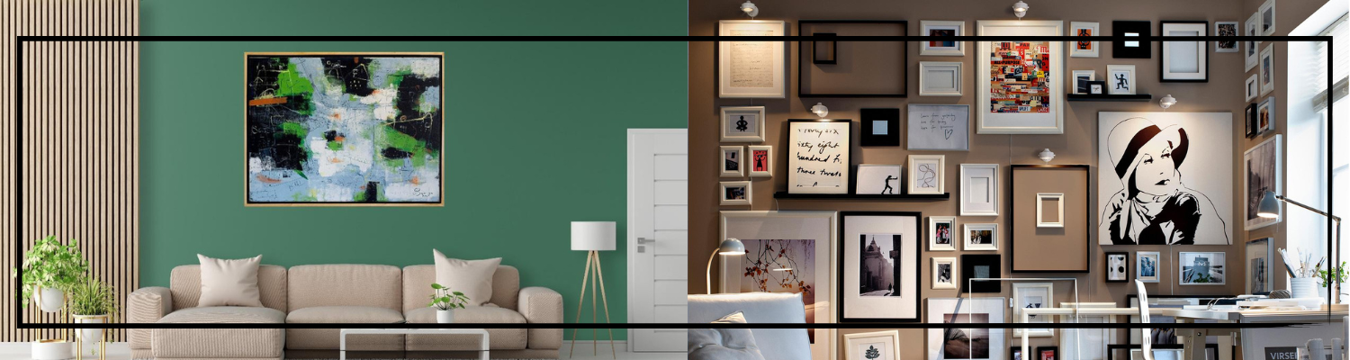
A gallery wall is choreography, visual movement across surface and silence. It's the arrangement of moods and subjects in spatial rhythm. The story told is one of harmony, not just in theme but in negative space. Whether symmetrical or asymmetrical, the layout must consider anchor points and visual weight. Each piece plays a role, some lead, some echo. Themes, color palettes, frame styles, medium types, act as threads weaving cohesion. Spacing isn't just measurement, it’s breathing between moments. The art must feel curated, not crowded, the arrangement intentional, never accidental.
Cohesion begins with a narrative. Select artworks that share a common thread, whether it's tone, theme, or color palette. Limit frame styles to two or three to prevent visual chaos. Vary sizes but maintain visual weight balance by placing heavier, darker, or larger pieces towards the center or bottom. Lay out the gallery wall on the floor first to test configurations. Use painter’s tape to map outlines on the wall, ensuring alignment and spacing. Create rhythm through repetition, echoing lines, subjects, or negative space. Cohesion isn’t uniformity, it’s intentional variation that feels connected, like movements in a suite.
The sweet spot for spacing lies between 2 to 5 inches, depending on frame size and wall area. Smaller frames demand tighter spacing, 2 to 2.5 inches, to read as a unit. Larger frames need room, 4 to 5 inches, to let each piece breathe. Equal spacing maintains symmetry and balance. Use a ruler or level to ensure consistency. The negative space between frames acts like punctuation in a sentence, it controls pace and readability. On expansive walls, increase spacing incrementally to avoid visual suffocation. Think of the wall as a score and each artwork a note, the rhythm must flow.
Art should be in conversation with the furniture, it shouldn’t float adrift. The alignment of artwork above a bed or sofa grounds both elements into a cohesive visual field. It’s not about centering alone, but about scale, proportion, and balance. The art must feel like an extension of the furniture’s presence, not merely an afterthought. Visual weight matters, bold artwork above delicate furniture overpowers, while too small pieces disappear. Think of art as a headboard or spine to the furniture beneath it, a continuation rather than a departure. Balance is key, both spatially and emotionally.
Yes, alignment fosters cohesion. Centering art with the furniture anchors the eye and unifies the vertical and horizontal visual planes. For instance, art above a sofa or bed should be roughly two thirds the width of the furniture piece to maintain proportional harmony. Aligning the vertical midpoint of the artwork with the eye level average (about 57 to 60 inches from the floor) while respecting furniture height ensures that neither feels visually dominant. Alignment does not mean rigidity, off center placements can work if intentional, but the relationship must feel balanced. Misalignment causes tension unless designed to disrupt, which few rooms can justify.
The standard distance is 6 to 12 inches above the top of the furniture. Closer to 6 inches for lower furniture or more intimate spaces like bedrooms, and up to 12 inches for larger, open walls. This distance keeps the art visually tethered while preventing crowding. Going too high detaches the artwork from the room’s conversation, leaving a void in between. When in doubt, lean toward closeness, it connects, grounds, and comforts the viewer. Consider the viewer’s line of sight when seated, artwork should remain a participant in the room’s emotional and visual dialogue, not an absentee.
Behind every graceful frame is quiet engineering. The integrity of a display rests on what’s unseen, studs, anchors, screws, levels. Heavier pieces demand robust support, wall anchors or stud mounted screws. Lightweight prints welcome command strips or small hooks. Picture wire offers adjustability, but D rings provide precision. A stud finder, though humble, is the curator’s compass, guiding placement with trust. Wall safety is a priority, not only for aesthetics but longevity. The right tools blend permanence with care, ensuring that the visual story you build remains intact, untarnished, and beautifully suspended.
For heavy pieces, over 20 pounds, stud mounted screws or heavy duty wall anchors are essential. Drywall alone can’t hold substantial weight. Use a stud finder to locate the wooden framework behind drywall for reliable support. Toggle bolts or molly bolts are effective when studs aren’t accessible. D rings combined with steel picture hanging wire provide even weight distribution. Level tools are crucial to prevent tilt. For gallery style security, consider French cleats or museum hooks, which distribute weight over a broader area. Never rely on nails or adhesive strips for heavy art, they may fail silently, risking both the wall and the artwork.
Protection starts with planning. Use painter’s tape to map placement without marking paint. For lighter works, command strips eliminate holes and residue, ideal for rentals or delicate walls. For nails or screws, pre drilling with a bit slightly smaller than the hardware reduces wall damage and cracking. Use bumpers or felt pads on the back of frames to prevent scuffs and maintain even spacing. Anchor only when necessary, use stud finders to reduce unnecessary holes. Over time, artwork may shift, installing anti tilt pads or locking brackets helps maintain alignment and wall integrity, preserving both structure and aesthetic balance.
Lighting does more than illuminate it reveals intent, texture, emotion, and depth hidden within the canvas. Accent lighting, particularly LED track lighting and spotlights, sculpts light to draw the viewer’s gaze exactly where the artist wants. The interplay between light and brushstroke can intensify shadows, elevate color saturation, or expose subtle gradations often lost in ambient setups. Artwork visibility becomes a curated experience, not a passive one. Strategic illumination turns static pieces into living visuals changing with perspective, time, and tone. Without proper lighting, even the most intricate oil textures or delicate watercolor washes risk fading into background noise.
Lighting acts as the unseen collaborator of the artist. It alters perception casting warmth onto a melancholic scene might soften its despair, while a cool spotlight over a vibrant abstract may introduce tension. Accent lighting allows for this manipulation, letting the light either cradle or confront the artwork’s tone. Soft illumination on Renaissance-style oil paintings, for example, elevates chiaroscuro effects, dramatizing form and contour. In contrast, harsh lighting might flatten dimensionality, robbing a piece of its emotional resonance. Thoughtful lighting synchronizes with the color palette, composition, and intended mood, ensuring that what’s felt is as clear as what’s seen.
For framed artwork, especially pieces protected by glass or varnish, non-reflective lighting is essential. LED spotlights or museum-grade LED track lighting offer clean, focused beams without emitting heat or UV rays that could degrade pigment. These fixtures enhance artwork visibility without distorting hues. Positioning is just as vital lights should be angled at 30 degrees to reduce glare and shadow-casting. For works rich in texture like impasto-heavy acrylics side lighting emphasizes depth and brushwork. Art glass with anti-reflective coating also complements lighting setups, preserving clarity. Ultimately, the best lighting respects the medium, preserves its longevity, and elevates the viewing ritual.
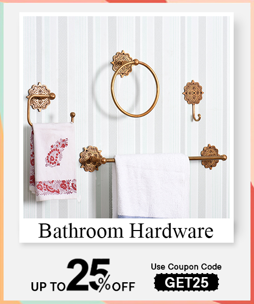
In visual storytelling through decor, walls are not equal. A bedroom wall demands intimacy, a space that invites calm, serenity, and the quiet of dusk hues. Meanwhile, the hallway space is a corridor of transit, ideal for sequential narratives like triptychs or thematic series. Living room design leans toward bold statement pieces, canvases that breathe, stretch, and frame the room’s personality. Bathroom decor, often overlooked, benefits from moisture tolerant mediums and abstract expressions that echo water’s rhythm. The spatial psychology of a wall, the way it receives light, holds texture, and interfaces with furniture, guides the placement of art like brush to canvas.
In smaller rooms, such as compact bedrooms or studio corners, art should mimic the scale of intimacy. Choose vertical compositions or minimalist arrangements that elongate the space without crowding the eye. These walls thrive with delicate strokes, watercolors, line drawings, or miniatures that allow visual breathing room. For larger rooms like expansive living areas, oversized canvases, gallery walls, or panoramic artwork create harmony and proportionality. Here, the wall becomes a stage, and the painting, its lead character. Large walls crave visual balance. Use center weighted compositions or diptychs to direct flow. Scale should complement, not dominate, the spatial architecture of the room.
Absolutely. Each room’s function dictates its emotional palette and, by extension, its visual narrative. A bedroom benefits from soft, textural work, canvas art with muted palettes, botanical etchings, or monochromatic ink washes that ease the mind. Living rooms, being social and expressive, are ideal for bold textures, oil on canvas works, or even mixed media. Kitchens and bathrooms, with their practical nature, demand resilience and clarity, framed prints, enamel backed artwork, or even ceramic tiles with visual flair. Art placement should also align with natural sightlines. In a living room, position art above sofas or mantels. In hallways, eye level continuity works best for flow.
Art and color must converse. The wall tone is the underpainting, an emotional primer on which your artwork builds. Palette coordination involves tuning the undertones of both paint and pigment. For example, cool grays pair effortlessly with blues or violets, while earthy beige walls soften the impact of deep greens or rusts. Using complementary colors, like burnt sienna against a sage wall, creates rhythmic contrast, invoking color psychology, a tool to shape mood. The harmony lies not in replication, but in resonance. When tones echo each other subtly, they bind the room’s elements like brushstrokes completing a canvas.
Start with undertones. Every color, warm or cool, carries emotional weight. A room with taupe walls feels grounded, best matched with dusty rose, olive, or indigo. Use a monochromatic scheme for subtlety or analogous colors to maintain a smooth visual flow. For instance, a pale green wall harmonizes beautifully with deeper forest toned landscapes or abstract art in soft chartreuse and teal. Art should either echo the room’s dominant palette or add nuance to it. Avoid exact replication. Texture matters too. A thick impasto painting on a matte wall enhances dimensionality. When in doubt, let a piece pick its wall through contrast or quiet complement.
Yes, when used with restraint. Contrasting colors, particularly from opposing ends of the color wheel, like cobalt against tangerine or crimson on a sage wall, create kinetic energy. This tension arrests the gaze, demanding attention. However, contrast without balance risks visual fatigue. Use it in spaces where energy and conversation thrive, dining areas, entrance halls, or creative corners. Pair bold color fields with neutral surroundings to allow the art its full volume. Consider also color field painting techniques, where color dominates form, these can serve as both décor and statement. Contrast, in art as in life, thrives in moderation and context.
In an open layout design, art becomes both wall and whisper. It defines, softens, and redirects energy. Instead of physical partitions, use visual anchors, large scale abstract paintings, wall mounted sculptures, or even textile based pieces like tapestries to draw boundaries without rigidity. This is zoning by perception, not obstruction. For a living dining hybrid, let a warm toned artwork in the dining area contrast with cooler hues in the lounge space. This dance of temperature, texture, and form creates fluid yet functional space separation, allowing each zone its own identity, like distinct yet harmonious movements in a symphony.
Absolutely. In a studio apartment, where privacy is a myth and space is a luxury, art becomes architecture. Use vertical art pieces to define “ceilings” for invisible rooms. A vivid canvas behind a reading chair carves out a contemplative zone, while a gallery wall behind the bed anchors intimacy. Choose varying scales and subjects for each zone, a minimal line drawing for the sleeping space, bold color fields for the living area. Materials matter too. Fabric based art warms a nook, while metallic prints signal transition. Wall art, in this sense, doesn’t just decorate, it dictates spatial choreography.
Select pieces with both weight and clarity. Triptychs work well as narrative partitions, they stretch across a wall and define continuity. Large format abstracts, especially in tonal contrast with the adjacent zone, act as powerful markers of boundary. Use framed art with strong geometric lines to segment dining from lounging, or textured canvas in muted tones to soften work from home nooks. Consider materiality, woodcut prints evoke groundedness, while acrylics can appear light and airy, great for multi use spaces. Avoid overly detailed pieces that distract. Instead, opt for works that suggest rather than scream. In shared spaces, suggestion is the subtlest form of control.
Read More : Understanding Modernist Paintings: Movements, Artists, and Influence in Art History
Sculptural or 3D wall art breathes presence into still spaces. It protrudes, invites shadows, and shifts perception with light. These aren’t just visual artifacts, they’re tactile narratives, borrowing from relief art, mixed media, and dimensional decor. Each piece leans into a duality: surface and depth, sight and sensation. The texture contrast these forms offer, a carved teak panel beside a flat ink sketch, lets the wall speak in multiple registers. Whether it’s plasterwork blooming outward or metal scripts curling off the wall, the story is physical. One does not merely look at 3D art, one feels the space around it contract and expand.
Start with weight and material. Plaster, wood, metal, each demands different fixtures. For heavier relief or mixed media pieces, use wall anchors or toggle bolts rated for double the weight of the art. French cleats provide excellent lateral stability, especially for bulky forms. Use a laser level to keep the composition aligned and test shadow play under natural and artificial light. Avoid adhesives unless the piece is featherlight. Sculptural art creates dimension but also carries torque. Anchoring it properly ensures safety without compromising the art’s flow. If it's a gallery wall, let 3D pieces punctuate the flat ones like rhythmic notes on a score.
Sculptural art thrives against restraint. Opt for matte finish walls in neutral or deep hues, charcoal, ecru, or indigo, to absorb light and highlight texture. Avoid glossy backdrops that reflect too much, flattening the relief’s shadows. Keep the wall clear of visual clutter so the piece retains spatial integrity. If the sculpture is metallic or glass heavy, place it against textural paint, limewash or brushed plaster, for contrast. Lighting should be angled, not frontal, to exaggerate contours. Frames or moldings should remain minimal or be intentionally absent, letting the form breathe into space. The backdrop is the canvas, the sculpture is its protagonist.
Art doesn't need to stay still. Let the walls breathe with the seasons. Rotational art brings rhythm, spontaneity, and lived in warmth. Embrace temporary mounts, seasonal decor infusions, and evolving curations that mirror inner and outer weather. Art rotation is not just design, it’s narrative in motion. Display light watercolor florals in spring, dense oils in winter. Use flexible fixtures that invite change, peelable hooks, ledges, magnet backed frames. Treat walls like a stage for temporal storytelling. Mixed media and photographic works can echo seasonal tones, while hand drawn botanical studies or paper crafts add organic softness that shifts with time.
Curate by color palette, mood, and material. Soft pastels and botanical prints for spring, rich sepia tones or impasto textures for autumn, cool abstracts for summer, and warm expressionist works for winter. To swap easily, use art ledges or clip frames which allow tool free transitions. Store unused pieces in archival sleeves to preserve integrity. Rotation isn’t a whim, it’s visual dramaturgy. Group artworks by size to maintain balance regardless of change. For layered walls, swap one piece at a time to maintain thematic rhythm. Let seasons not just dress your rooms but redefine your walls, subtly, sensibly.
Use floating picture shelves, magnetic panels, or command strips for featherweight works. For midweight framed art, opt for D rings with adjustable cables or Velcro hanging systems. Peg rails or slimline hooks embedded in crown molding allow for vertical shifting without new holes. Consider gallery rods with sliding hooks for effortless updates. Fixtures should invite mobility without risking structural integrity. Avoid over tightening, some looseness lets heavier artworks settle into gravity without strain. The goal is fluidity. Fixtures that become invisible players in an ever shifting visual orchestra. They hold stories, then step aside for the next one.
Eclectic doesn’t mean erratic. It’s a choreography of contrast, a deliberate clash where modern abstracts kiss Mughal miniatures, and Bauhaus meets tribal inkwork. It's a layering of timelines and tones. Mixing art styles, expressionist, impressionist, minimalist, folk, requires rhythm and restraint. Use palette bridges, recurring motifs, or shared framing styles to stitch coherence. Art diversity isn’t disorder, it’s orchestration. Eclectic interiors thrive on juxtaposition, a gold leaf traditional painting beside an abstract chaos of acrylics, or ink sketches tempered by folk textile frames. The tension between epochs births a new kind of beauty, intimate, layered, rebellious.
Yes, but not arbitrarily. Use compositional anchors like color themes or shared textures to blend them harmoniously. Let the traditional art ground the wall, its structure, symmetry, and craftsmanship offer gravity. The abstract piece, with its wild energy or emotional ambiguity, becomes the counterpoint. Together, they form a visual sonata, order and chaos dancing side by side. Spacing is crucial, don’t crowd. Use negative space as a buffer. Framing should be considered, a heavy traditional frame beside a borderless canvas needs intentional balancing. Think of it as curating conversation, two voices from different times speaking a common emotional language.
Find your visual thread. It could be tonality, shape, framing material, or subject matter. Use the 60 30 10 rule from design, 60 percent dominant style, 30 percent contrasting, 10 percent accent. Or go with a central anchoring piece that unifies the wall, a large neutral toned abstract or a central mirror. Group artworks in threes or fives, balancing scale and visual weight. Keep the wall’s architecture in mind. Moldings, corners, and ceiling height influence flow. Contrast is fuel, but without pattern or restraint, it becomes noise. Balance is achieved through rhythm, not repetition.
Architectural features, arches, moldings, wall niches, aren’t obstructions. They’re framing devices. They guide the eye, suggest storylines. Arranging wall art around them demands intuitive geometry and emotional sync. A painting near a window borrows its light, one near trim must honor its edges. Use negative space not as absence, but tension. Sculptural pieces feel at home in niches, line drawings love the border play of molding. Let arches cradle ovals or circular frames, and allow asymmetry when symmetry feels forced. The wall is not blank. It breathes with past design decisions. The art must become part of that breath.
First, observe the light. Art near windows is bathed, often unevenly. Avoid direct sunlight on delicate works, opt for UV protected frames. Balance the asymmetry. If a window dominates one side, add visual weight to the other through vertical art or gallery stacking. Use trim lines as guides, align frames parallel or contrast with diagonal placements for drama. Consider scale, small frames for tight spaces, tall art to elongate beneath transoms. Leave breathing room. Let windows reflect light into the artwork’s narrative, but never overpower it. Art styled near trim must dance with the architecture, not compete with it.
Read More : Exploring Collage Painting: Techniques, Styles, and Artistic Expressions
Rethink the obstruction as part of the story. Treat moldings, switches, vents, or awkward corners as design prompts. Instead of avoiding them, integrate. Float artwork around them, split diptychs across obstructions, or cluster small works to echo their shapes. Built ins or niches welcome 3D art or shadowboxes. Use corner wraps, art that bends across two walls, or hang lightweight pieces from ceilings via decorative chain for high obstructions. Tall arches, frame them with vertical works that mimic their flow. Let the obstacle direct placement, not limit it. In art, tension and interruption can be tools, not threats.