


-
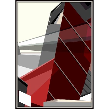
Architectures of Tension Digital Artwork on Canvas by Artist Suparna Sen in Set of 3
- ₹ 5,000.00
- 10 In Stock
-
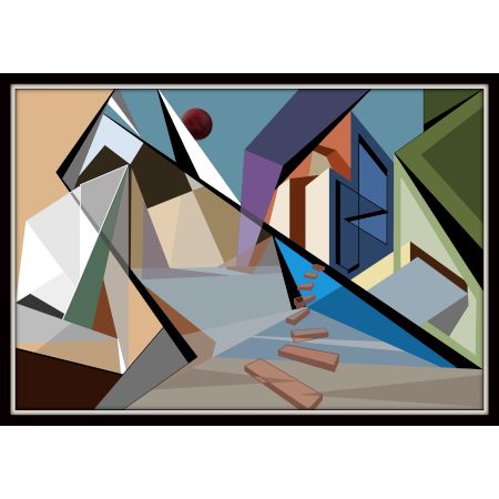
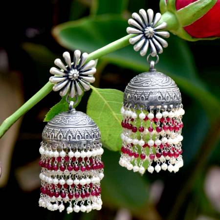
Fragments of Perspective Canvas Digital Artwork by Artist Suparna Sen 11.5 x 16.5 Inc...
- ₹ 2,000.00
- 10 In Stock
-

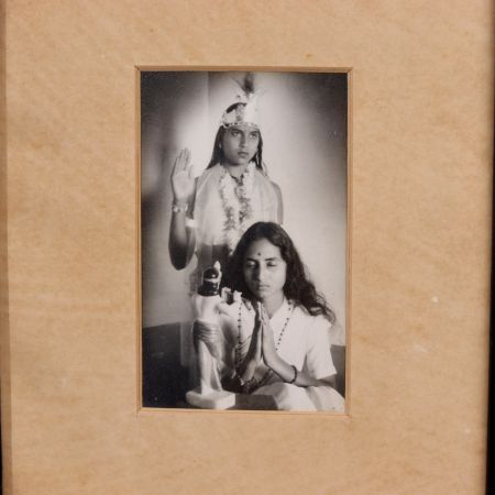
The Old is Leaving Canvas Digital Painting by Artist Kunal Vardey 12 x 16 Inches
- ₹ 32,000.00
- 2 In Stock
-

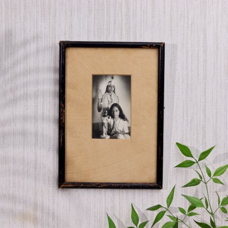
Looking for faith Canvas Digital Painting by Artist Kunal Vardey 21 x 16 Inches
- ₹ 32,000.00
- 4 In Stock


.JPG?ver=1.7)
.jpg?ver=1.7)


.JPG?ver=1.7)
.JPG?ver=1.7)
.JPG?ver=1.7)
.JPG?ver=1.7)
.JPG?ver=1.7)
.JPG?ver=1.7)
.JPG?ver=1.7)
.JPG?ver=1.7)
.JPG?ver=1.7)
.JPG?ver=1.7)
.JPG?ver=1.7)
.JPG?ver=1.7)
.JPG?ver=1.7)
.JPG?ver=1.7)
.JPG?ver=1.7)
.JPG?ver=1.7)
.JPG?ver=1.7)


General Understanding of Prints and Lithographs
Prints and lithographs stand at the intersection of tradition and replication—mechanical yet intimate. They allow original artworks to traverse walls, continents, and lifetimes, without diluting their emotional resonance. A lithograph isn’t just a copy; it's a deliberate echo. Each technique—whether hand-pulled or digitally rendered—carries its own signature, texture, and aesthetic vocabulary. Some mimic the grain of graphite, some the flow of ink, and others the vibrancy of brushstrokes. Understanding these mediums is about decoding not just the process, but the intention—what they preserve, what they sacrifice, and how they translate the soul of an original into a piece meant to travel.
What Is A Lithograph Or Art Print?
A lithograph is a form of printmaking where the artist draws with a greasy substance onto a flat surface—typically limestone or a metal plate. This surface is then chemically treated so that ink adheres only to the drawn areas, repelling water from non-image spaces. The print is then pressed onto paper, capturing not just linework but the pressure and texture of the artist’s hand. In contrast, art prints can also refer to digital reproductions, like giclée, where pigment-based inks are sprayed onto canvas or paper with exquisite resolution. Both serve to democratize access to art—making museum-quality work available to more homes, studios, and collectors. What makes them different from posters is the integrity of their production—the detail retention, the paper quality, the inks used, and the intent behind them. A lithograph is labor. A fine art print is precision. Both are emotional translations of an original vision.
What Does A Lithograph Aim To Capture Or Convey?
The purpose of a lithograph isn’t replication—it’s continuity. It preserves the emotional undercurrent of the original work: the pressure of a charcoal stroke, the grain of a shaded fold, the stillness between two shapes. Lithographs capture mood. They convey silence and movement equally—through line thickness, tonal transitions, and paper texture. The goal isn’t to trick the viewer into thinking it’s an original—but to offer a parallel experience. A lithograph also conveys accessibility—a democratic gesture in an otherwise exclusive art world. It enables collectors, curators, and even casual art lovers to share in an artwork’s rhythm, emotion, and historicity. The best lithographs don’t just show you what was drawn—they tell you why it was drawn. And in rooms adorned with them, they speak not as decoration but as persistent whispers from the artist’s own breath, intent, and philosophy.
What Are The Different Types Of Prints And Lithographs?
Art prints are not a monolith—they are categorically diverse, each type carrying its own fingerprint, value, and emotional pitch. Some are born in limited runs, others as open editions; some are signed with human presence, others are mass-distributed without attribution. The variations aren’t just technical—they influence collectability, authenticity, and connection. Lithographs too have types—manual or mechanical, numbered or unsigned, each speaking to a different artistic need or commercial intention. In galleries or online shops, knowing the type of print you’re looking at helps decode its origin story—how it was made, how many exist, and why it may or may not hold long-term value.
From limited-edition hand-signed lithographs to open-edition decorative prints, each type varies in exclusivity, reproduction method, and investment value. Limited-edition prints are produced in small batches—often signed and numbered by the artist, making them collectible. They hold value not just in artistry, but in scarcity. Open editions, by contrast, are unlimited and meant for mass appeal—used often in interior decor. They prioritize accessibility over uniqueness. Signed prints without an edition number lie in between—more personal than open editions but less exclusive than limited runs. Hand-pulled lithographs are made directly by the artist or under their supervision, each bearing small variations, like brushwork frozen in a moment. Offset lithographs are mechanically printed and less valuable but still visually engaging. And giclée prints—made with archival inks and high-resolution printers—offer the closest visual mimicry of originals. Each version plays a different role: artifact, accent, or archive.
Techniques & Tools of Prints and Lithographs
The essence of a good print lies not just in the image—but in the way it’s built. From the right paper grain to calibrated inks, from traditional stone to modern inkjets—every material, tool, and technique tells a part of the artwork’s story. The technology behind reproduction has evolved, but the heart of the process remains unchanged: preserve integrity, capture texture, and maintain emotional truth. Knowing the tools and materials helps identify not only what went into making the piece—but what it’s capable of expressing. It’s craftsmanship meets curation.
How Do You Reproduce Art Accurately Through Prints Or Lithography?
Art is reproduced accurately through a blend of precision, patience, and technical fidelity. For digital prints like giclée, high-resolution scanners capture every nuance—color gradients, brush textures, even the canvas grain—at microscopic levels. Then, color calibration ensures that printed pigments align with original hues, adjusted for light reflectivity and paper tone. For lithographs, accuracy starts with the hand: the artist redraws the original onto a plate, maintaining gesture and pressure. That plate is then inked and pressed, pulling each line, blotch, or haze into paper with care. Even in mechanical methods like offset printing, layers of cyan, magenta, yellow, and black (CMYK) are applied with laser precision to simulate every contour. The final output is reviewed—often in proof rounds—until it matches the emotional and visual pulse of the original. What emerges is not a copy, but a mirror with memory—a print that holds the spirit of the original work.
What Materials Are Used In Lithograph And Print-Making?
Material defines experience. In print-making, the canvas isn’t just a surface—it’s a voice. Lithographs traditionally use limestone or aluminum plates, absorbing greasy inks that are repelled by water. The ink—often oil-based—is sticky, tactile, full-bodied. It clings to linework with a physicality that feels handcrafted. The paper matters—archival, acid-free, and rich in cotton for durability. It absorbs ink without bleeding, retaining texture and depth. For modern prints like giclée, pigment-based archival inks are used—vibrant, fade-resistant, and capable of microscopic detail. Substrates include canvas, photo rag, watercolor paper, or textured fine art paper, depending on the intended finish. Presses—manual or mechanical—apply pressure to unite ink and paper with grace. Every component—the ink’s density, the paper’s tooth, the press’s consistency—shapes how the final artwork will feel, last, and live. These materials aren’t just tools; they’re collaborators in storytelling.
How Do You Choose The Right Type Of Print For A Subject Or Room?
Art selection is part visual, part visceral—it’s about aligning form with feeling. The type of print you choose should resonate with both the subject of the artwork and the character of the space it inhabits. A giclée print with high-resolution detail and vivid color suits modern rooms with clean lines and contemporary furniture. Think landscape photography, still-life realism, or surrealist intricacy. A stone lithograph—with its grainy texture and handmade edges—adds soul to vintage or rustic interiors. Perfect for sketches, poetic abstractions, or monochrome pieces. Screen prints, with flat colors and graphic edges, add punch to industrial spaces or minimalist walls—best used for pop art, typography, or modernist shapes. Room lighting matters too—UV-resistant coatings for sunlit rooms, matte finishes for softly lit spaces. Choose based on emotion, not just aesthetics—what does the space whisper, and what does the artwork answer? When matched right, print and place become a shared story.
Purchase & Options of Prints and Lithographs
Art prints and lithographs occupy a curious space—between accessibility and artifact. Their purchase is no longer confined to white-cube galleries or auction rooms. In today’s layered aesthetic world, they’re sold through quiet online ateliers, print houses with a history of ink-stained hands, or even emerging artist-run websites that offer direct connection with the maker. The beauty of acquiring such works lies not just in possession, but in provenance—the story carried by paper, plate, and signature. Quality is often a balance between technique, authenticity, and presentation. The right place to buy isn’t the most famous, but the most attuned.
Where Can You Buy Quality Art Prints And Lithographs?
Quality art prints and lithographs can be found where curation meets credibility. Begin with artist studios or official artist websites—these often carry signed, limited-edition prints that retain emotional proximity to the original. Galleries, both physical and online, often collaborate with master printers, ensuring that the print adheres to museum-quality standards. Then there are fine art print houses—spaces like Crown Point Press or Gemini G.E.L.—which specialize in artisan-level lithography and editioned works. Online marketplaces like IndianShelf, Saatchi Art, 1stDibs, or Artfinder also offer curated selections, but require checking for edition verification, certificate of authenticity, and archival quality materials. Look for archival inks, acid-free paper, and edition numbers. Stay wary of posters marketed as “prints.” The emphasis should be on process and provenance. Buying a print isn’t just a transaction—it’s acquiring a moment of someone else’s imagination, translated into touchable permanence.
Comparison of Prints and Lithographs
In the textured world of visual storytelling, originals are raw breaths—the unfiltered pulse of the creator. Prints, however, are echoes curated for wider reach. They are intentional translations—faithful, yet slightly distanced. A lithograph holds the grain of the original; a digital giclée holds the detail. Originals are one-of-one. Prints are one-of-many—but when done right, they lose none of the soul. The real difference lies not in visual output but in presence, rarity, and material intimacy. Both serve different roles in art ownership: one for reverence, the other for resonance.
Prints Vs Originals: What’s The Difference?
An original artwork carries the full spectrum of the artist’s process—brush tension, ink pooling, smudges, pauses—everything is alive and irreversible. It’s tactile, layered, and emotionally unfiltered. A print, on the other hand, is a carefully constructed mirror—engineered to carry the visual and tonal feel of the original, but without its spontaneity. The strength of a high-quality print lies in its fidelity to emotion and form. Techniques like stone lithography preserve texture, while giclée ensures tonal sharpness. Originals are unique and demand a premium due to rarity and personal labor. Prints make art accessible, scalable, and democratized. They enable collectors to bring museum-quality visuals into personal spaces without compromising beauty or depth. For those who seek aura, originals matter. For those who seek atmosphere, prints suffice. Both are valid—just tuned to different frequencies of appreciation.
Creative Use & Aesthetics of Prints and Lithographs
Prints and lithographs aren’t just static visuals on a wall—they are fluid elements of mood curation. They help in shaping room narratives, anchoring visual identity, and weaving emotional layers into spaces. Whether used to complement color palettes or act as statement anchors, their versatility is unmatched. With their varied finishes—grainy lithographs, vivid giclées, bold screen prints—they become part of the architecture itself. Used wisely, they don’t decorate—they whisper, align, surprise, and sometimes confront. They lend not only texture, but also tone. Art, after all, is not an object—it’s a presence.
What Are Some Creative Uses Of Prints Or Lithographs In Home Decor Or Art Projects?
Prints and lithographs serve as visual punctuation marks in interior storytelling. A set of monochromatic lithographs in antique frames can evoke vintage nostalgia in a hallway. A bold giclée diptych above a sofa brings color balance and emotional rhythm. In bedrooms, smaller prints stacked salon-style around a reading corner invite intimacy. Beyond décor, prints can become creative projects—cut into mood boards, layered into journaling, or integrated into art collages. In offices, architectural prints instill clarity; in kitchens, botanical lithographs ground the space with natural rhythm. Thematically, one can build walls around moods—serenity, energy, chaos—depending on the print’s character. Even more experimental uses include print-based tabletop installations, rotating seasonal art displays, or framed print-sleeve hangers that allow for monthly swaps. The key is to treat each print not as a decoration, but as a collaborator in the emotional architecture of a space.
Faqs
What Are Art Prints Or Lithographs Used For?
Art prints and lithographs function as visual bridges between imagination and everyday space. They democratize fine art, translating once-untouchable brushstrokes into accessible intimacy—whether for quiet contemplation, stylistic accentuation, or curated gifting. In living rooms, galleries, or libraries, they hold space for both aesthetic elevation and cultural introspection. In educational contexts, they preserve historical accuracy while sparking visual literacy. And in gifting, they extend emotion with permanence. Their tactile resonance—be it the granularity of a lithograph or the silky gradient of a giclée—brings the viewer closer to an artist’s rhythm without the exclusivity of original ownership. They do not merely decorate; they narrate.
What Surface Or Paper Type Is Best For High-Quality Art Prints?
Surface choice is not just a medium—it's a silent co-creator. Archival matte paper grants a powdery, non-reflective depth that complements subtle tonal shifts. Cotton rag, heavy with tooth, retains pigment with grace, mimicking canvas without overwhelming the visual dialogue. Canvas, stretched or flat, amplifies volume and texture—ideal for paintings-turned-prints. The best paper depends on the narrative: does the piece whisper or announce? Longevity, ink retention, and tactile fidelity all orbit around paper weight, finish, and absorbency. Fine art demands a surface that doesn't just support color but elevates its intention—archival materials ensure that story survives the decades.
Can Art Prints Be Framed Or Preserved Without Damage?
Absolutely—framing is both protection and performance. A well-framed print becomes architectural: layered with acid-free mats to avoid yellowing, sealed with pH-neutral backings to shield against warping, and protected by UV-resistant glass to prevent chromatic erosion. Humidity control and sunlight deflection are critical; even the wall it leans against must be cool and dry. Float mounting enhances visual drama, while traditional matting brings focus inward. Preservation isn't just archival—it’s emotional: it safeguards the memory embedded in pigment. With the right framing, a print doesn’t just endure—it matures, becoming part of a domestic museum curated by time and taste.
Are Prints And Lithographs Permanent Or Do They Fade?
Prints live long lives—when chemistry and care align. Archival inks, pigment-based rather than dye-based, resist the fading ghosts of time. When printed on acid-free surfaces and housed in stable, light-controlled environments, art prints can retain their vibrancy for over 75 years. Lithographs, too, endure when pressed with high-quality stone or plate materials and stored away from environmental stressors. Sunlight, moisture, and pollutants are their nemeses, slowly muting vibrancy if unchecked. Yet, when given the reverence they deserve—through UV glass and controlled display—prints don't just age, they patina. Their endurance becomes a quiet form of protest against the ephemeral.
What Printing Method Is Best For Capturing Deep Tones Or Fine Details?
Giclée printing reigns supreme for tonal fidelity and micro-detail. Using inkjet technology with pigment-based inks and high DPI (dots per inch), giclée can replicate even the subtlest gradations, from whispered shadow to illuminated edge. It’s particularly favored in photographic realism or fine-detail illustrations. Lithography, by contrast, thrives in expressive contour, organic grain, and textured emotion—evoking the spirit of the handmade. It excels in mood rather than minutiae, in gesture rather than gradient. Choose giclée for quiet precision, lithograph for soulful vibration. Each technique is a language—select the one that best echoes your visual lexicon.
Are Printing Techniques Consistent Across All Artistic Styles?
Printing is not monolithic—it’s interpretive. Photorealistic or digital-native works favor giclée, which preserves photographic realism and intricate gradients. Watercolor reproductions or mixed media with delicate transparencies also benefit from giclée’s nuanced ink layering. Meanwhile, vintage posters, bold illustrations, or stylized sketches find their soul in lithography—its grain echoing ink bleed, its press pressure adding visceral heft. Even screen printing, serigraphy, or risograph offer distinct emotional registers. Each technique has its tempo, and when aligned with the original medium’s intent, the reproduction sings instead of stumbles. The medium should never dilute the message—it must amplify it.
What Is The Cultural And Historical Significance Of Prints And Lithographs?
Prints are democratic storytellers. From the 18th-century revolutions to modern poster art, lithographs gave voice to artists and movements otherwise confined to salons or cathedrals. Daumier sketched satire into stone; Toulouse-Lautrec turned Parisian nights into collectible ephemera. Printmaking collapsed class lines—what was once for royalty became accessible to the bourgeois, then to all. Cultural identity, political dissent, myth, and memory—each found permanence through ink and press. The print is a relic and a revolution—archiving both aesthetic and moment. In contemporary times, prints remain time capsules, whispering the tactile urgency of the original while enabling replication without erasure.
How Can You Clean, Preserve, Or Frame Prints Effectively?
Preservation begins with touch—always use cotton gloves to prevent oils from staining the surface. Never clean with solvents or sprays; instead, dust gently with a microfiber cloth or soft brush. Storage? Flat, acid-free folders in climate-controlled environments. Framing calls for archival mats, UV-protective glass or acrylic, and sealed backs to guard against pests and moisture. Avoid direct sunlight, damp corners, or overexposure to artificial light. Think of prints as living things—they breathe, age, and respond. Proper framing isn’t just functional; it’s ceremonial. It turns a print into a preserved narrative, ensuring every hue and shadow endures undistorted.
How Do Different Printing Techniques Affect The Mood Of A Piece?
Technique sculpts tone. Lithography, with its smudged grain and press-textured edges, evokes warmth, nostalgia, and a handmade aura. It breathes the human touch into every imperfection. Giclée, in contrast, offers clarity, serenity, and precision—its smooth gradients echo silence and stillness, often lending realism a cinematic calm. Serigraphs evoke energy, their bold layers pulsing with vibrancy. Woodblock or etching may feel ancient, sacred, or folkloric. The emotional frequency of a print shifts with its technique—like changing instruments for the same composition. The choice of medium becomes mood architecture, where ink is not just pigment but feeling.
How Can Prints Or Lithographs Harmonize With Wall Colors And Decor?
Placement is choreography. A soft, neutral-toned print on textured archival paper can create quietude against saturated walls—letting space and image breathe. Monochrome lithographs exude elegance on muted palettes, while bold abstract giclée prints inject vitality into minimalist interiors. Matting adds visual pause; framing offers definition. Consider frame tone against furniture wood, print hue against wall color, and scale relative to surrounding objects. Harmony isn't about blending—it’s about intentional dialogue. The print becomes a punctuation mark within spatial syntax, its color and tone either echoing or counterpointing the environment with curatorial precision.
Can Art Prints Serve As Thoughtful Gifts For Occasions Like Housewarmings?
Yes—because prints carry intention. A limited-edition lithograph of a cityscape can commemorate a move. A botanical giclée print might evoke calm for a new kitchen. Prints adapt to intimacy—they feel personal without the pressure of extravagance. Their textures, colors, and themes can mirror a friend’s aesthetic, values, or origin. Unlike generic décor, they can be framed memories, philosophical tokens, or aesthetic anchors. With careful choice—framed professionally or packaged with archival care—prints become heirlooms-in-waiting, outlasting trends and speaking in visual shorthand. They gift not just beauty, but presence.
What Are Some Creative Display Or DIY Framing Ideas For Prints?
Creative framing transforms prints into living design statements. Consider float mounting within deep shadow boxes for depth, or pair raw-edge prints with minimalist clips for an industrial edge. For a gallery wall, use mismatched frames unified by mat color. Washi tape corners can offer a bohemian, temporary display. Wooden poster hangers give Scandinavian flair, while vintage window frames act as rustic borders. Repurposed glass panes or reclaimed wood infuse sustainability. Backlighting translucent prints can create a luminous, art-lamp hybrid. DIY framing isn’t about cost-cutting—it’s about storytelling. Every frame, every texture, echoes the print’s visual voice.